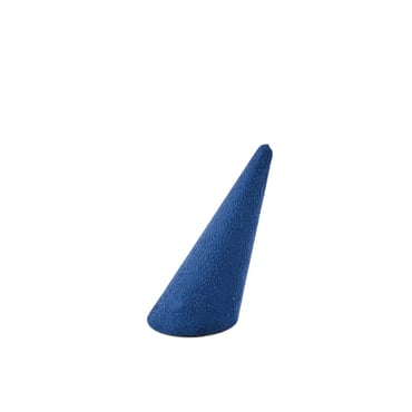
This Season’s Story: Navy Suede in Luxury Retail
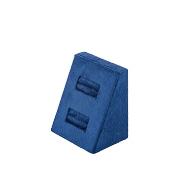
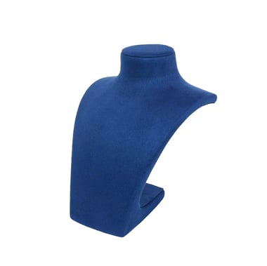
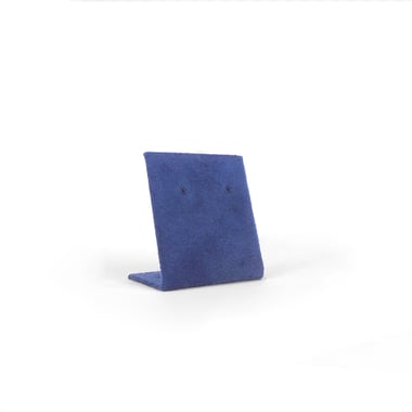
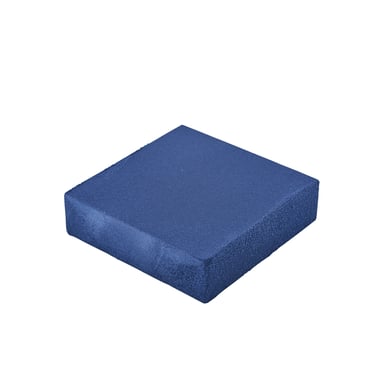
Navy blue suede has always been a classic, but in summer it takes on a fresh relevance. Its depth of colour offers a refined alternative to black, while its softness avoids the severity that darker shades can sometimes carry. In retail, navy suede performs beautifully as a backdrop for jewellery, watches and accessories: it cools yellow gold, intensifies the brilliance of diamonds and gives platinum and silver a crisp clarity. Optical frames with tortoiseshell or metallic finishes look particularly striking against it, while fashion accessories gain a touch of maritime elegance.
For brands, navy suede is a versatile seasonal tool. It reads nautical and confident when paired with white and brushed steel, yet sophisticated and luxurious when combined with walnut or brass. It allows displays to transition smoothly from spring into high summer, offering retailers a way to refresh their visual identity without losing a sense of continuity. In jewellery and watch environments especially, it provides the perfect balance between formality and lightness, helping pieces stand out in the bright, sunlit conditions of the season.

The Underestimated Presence of Navy
Navy has quietly become a seasonal signature across high-end retail. Mediterranean fashion houses with strong nautical roots lean on navy suede accents to reinforce brand heritage in summer campaigns, often staging accessories against deep blue props for both window and editorial photography. Watch specialists like Laings have introduced navy suede presentation trays into their summer edits, finding that the depth of colour steadies polished steel and ceramic, while also translating seamlessly into social media photography.
Contemporary fashion brands such as Burberry and Orelia have drawn on navy as a seasonal anchor, pairing it with white, walnut or gold accents to refresh boutique interiors without a complete redesign. In each case, navy suede has functioned as more than a prop, it has become a material language that expresses confidence and luxury in a season defined by light.

Nautical Elegance: Coastal Charm Meets Enduring Style
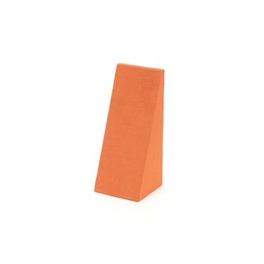
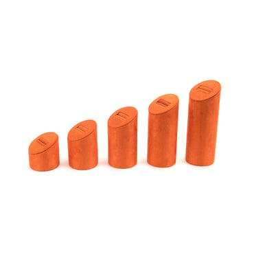
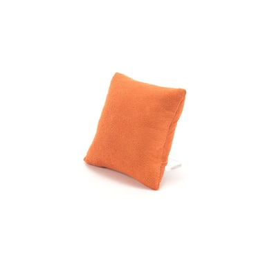
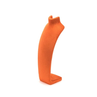
Few combinations speak of summer more fluently than navy suede paired with natural wood textures, lifted by a touch of orange. The cool depth of navy finds balance in the organic grain of walnut or oak, creating a grounded base that feels enduring and luxurious. When a subtle orange accent is introduced, whether through fabric, signage or seasonal product, it sparks energy without overwhelming the display.
In jewellery, this palette highlights yellow gold with a richer glow and makes coloured gemstones such as citrine, coral and amber appear even more luminous. Watches presented on navy-lined walnut trays with a discreet orange detail project both heritage and modernity, appealing to traditional collectors and younger clients alike. In optical displays, tortoiseshell acetates gain clarity against navy suede, while the warmth of orange accessories lends a boutique edge. The trio feels elegant yet dynamic, the kind of palette that makes a counter or window look instantly editorial.


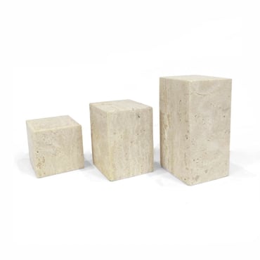
Exquisitely Luxurious: A Rich Blend of Texture and Tone
The quiet luxury of navy suede becomes something extraordinary when placed alongside the pale natural tones of travertine and accented with brushed gold. The stone’s soft veining grounds the palette in calm, architectural elegance, while navy suede brings depth that absorbs light and sharpens jewellery and watch details. Brushed gold adds the final layer of refinement, a glow that feels indulgent but never showy.
Jewellers use this combination to stage diamonds and coloured stones, where the interplay of cool and warm tones enhances brilliance and saturation under summer spotlights. Watch boutiques favour it for the way brushed steel and ceramic models gain composure on navy, while rose gold or bronze editions resonate with the subtle metallic warmth of the accents. Optical frames also benefit, as the cool blue and warm gold balance each other against the neutral travertine base. This is a palette that reads international and aspirational, equally suited to grand flagships and contemporary independent retailers looking to signal elegance.


Contemporary Colour Clash: Bold Contrast, Balanced in Perfect Harmony
Navy suede and white leatherette already create one of the most effective summer combinations: clean, fresh and unmistakably premium. But when a pop of colour is introduced - turquoise, coral, emerald or even a bold seasonal hue, the story shifts from classic to contemporary. The navy provides depth, the white sharpens edges, and the accent injects life, creating a composition that feels editorial and playful while remaining luxurious.
Contemporary colour clash

In jewellery displays, a single coloured gemstone echoed in a riser detail or tray lining reinforces storytelling and draws the eye immediately to the hero piece. For watch displays, a pop of colour in a suede insert highlights limited editions and seasonal launches without disturbing the overall clarity of the set. Optical boutiques use it to mirror frame colours, creating rhythm across a wall bay, while fashion props gain personality from a single cube or plinth in an accent shade. This is the combination that allows retailers to speak both of discipline and creativity, offering clarity for the season and distinction for the brand.